First of all download latest version of python :-
from website
https://www.python.org/downloads/
& install python.
Step 1:- create folder okpython in your d: drive then open command prompt and type following commands as shown below:-
step 2:- Setup Virtual Environment
D;\okpython> python -m venv env
Step 3:- to activate virutal enviornment
Step 4:- To install matplotlib type command pip install matplotlib as shown below :-
step 6:- in your command prompt type following command to run this file as shown below :-
Output you will see :-after
it download csv file form link :-
https://geocities.ws/ommauryasir/python/data.csv
and
keep this data.csv file
under your okpython folder
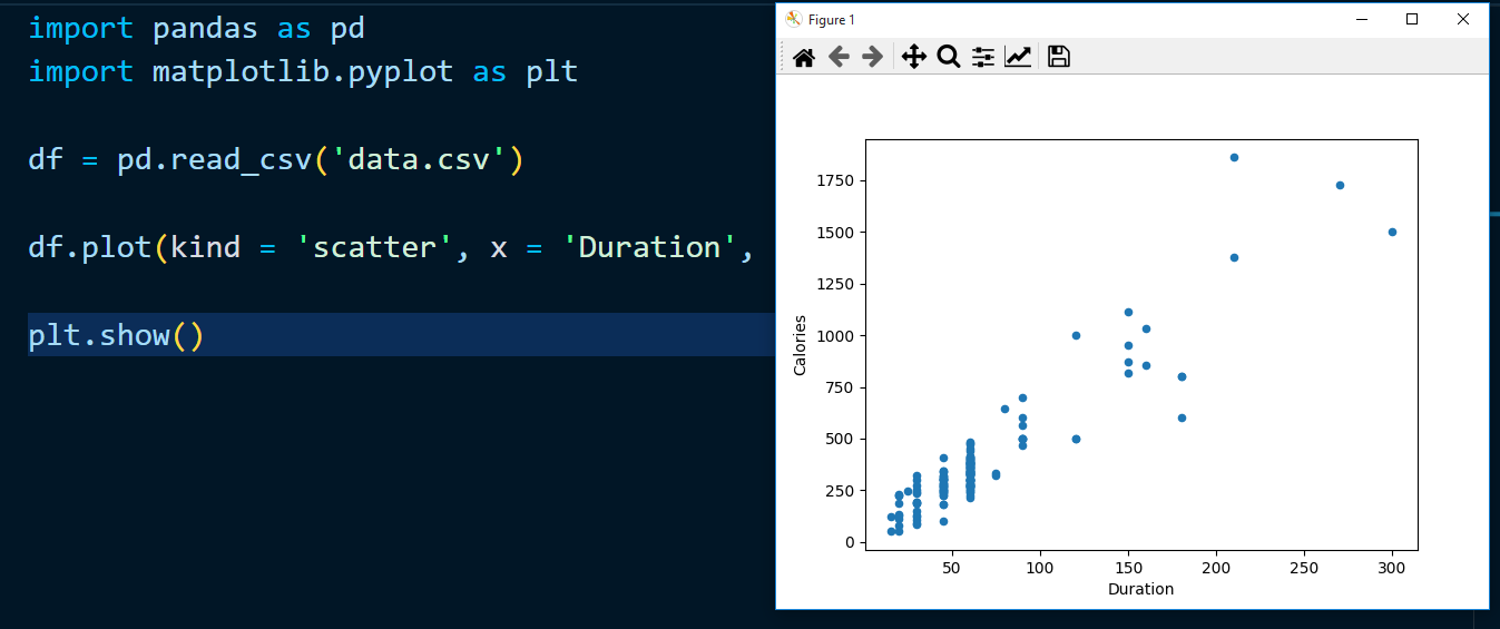
Scatter Plot :-
Specify that you want a scatter plot with the kind argument:
kind = 'scatter'
A scatter plot needs an x- and a y-axis.
In the example below we will use "Duration" for the x-axis and "Calories" for the y-axis.
Include the x and y arguments like this:
x = 'Duration', y = 'Calories'
write following example code py2.py file :-
output:-
Histogram:-
Use the kind argument to specify that you want a histogram:
kind = 'hist'
A histogram needs only one column.
A histogram shows us the frequency of each interval, e.g. how many workouts lasted between 50 and 60 minutes?
In the example below we will use the "Duration" column to create the histogram:-
Output:-
Example to run in your visual studio code as shown below are :-
1)
2)
Sign up here with your email


ConversionConversion EmoticonEmoticon